For whatever reason, I was inspired to start playing with logo designs. There’s no new decisions to be seen here in this post, just some ideas I’m playing with (and rejecting).
I actually used to make my own typography and font designs, one such example is this:
You can see more examples of prior logos here.
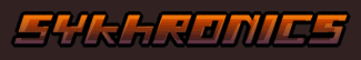
For the past 5 years I’ve been using this:
I don’t know if I’ve ever really liked it, but it was good enough. The thing is, it WAS good enough, not so much anymore (or in other words, I’m bored of it).
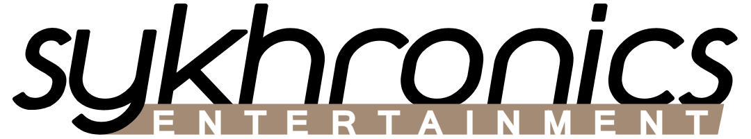
Neither that or Smiles use fonts I created, with the exception of the Smiles logo and PAUSE/UNDO text.
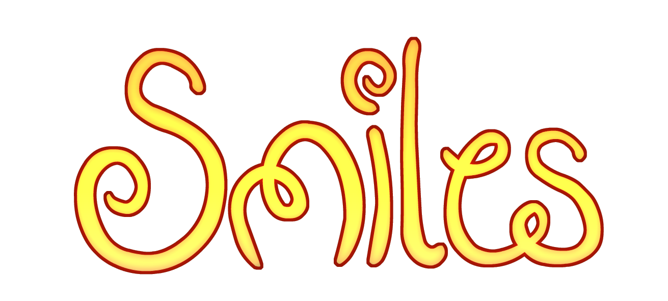
Smiles… it’s a logo, and the only original typography design I’ve done in years
So seeing how the 5 year anniversary of Sykhronics Entertainment is coming up, as well as some new projects, I think it’s time to start thinking about the branding.
In the “old days” (1998-2005), Sykhronics was an all-caps logo. When it became my dayjob, it went lowercase. For the new logo, I’m thinking about going back to the caps look, and maybe making my own font design again.
Before I go there though, I wanted to play around with some general type ideas.
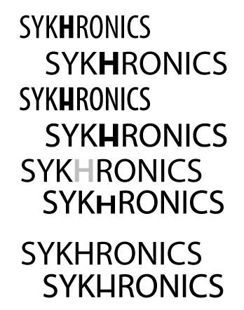
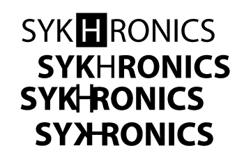
What is definitely not obvious, Sykhronics is pronounced “Sigh Cron Icks” (Sy Khron Ics). It’s a invented word of mine that, for whatever reason, has a silent H in it. And for whatever reason, I don’t think I’ve ever done anything to emphasize (or rather, de-emphasize) the H. I could have just axed it (I do own the H-less domains), but it’s such an absurd word anyways, I left it in.
So the majority of my experimenting today is with the H.


Or as text:
SYKHRONICS . . . . . SYKHRONICS . . . . . SYKHRONICS
SYKhRONICS . . . . . SYKhRONICS . . . . . SYKhRONICS
sykhronics . . . . . sykhronics . . . . . sykhronics
sykHronics . . . . . sykHronics . . . . . sykHronics
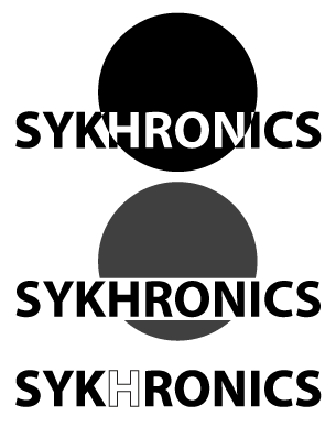
The circle designs, there’s no hidden message there (MOONS!), just that the logos are all very wide. Whatever I design should last me the next 5 years (at least), so one idea I’ve been toying with is styling it to suit the game. The circle is a sort-of guide, showing where the per game identity “thing” would go. If I was to style it to Smiles, it’d probably have the Mushroom character curling and peeking over.
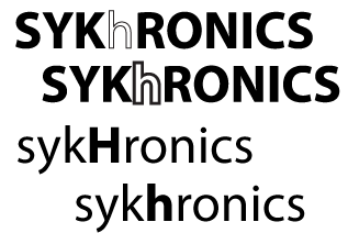
Other things I tried above was a lower line on the H. I kinda like it, but I also realized later I kinda like the lower case h too. The lower case H version works well in actual text too. There’s also the faint gray and outline H versions, which I think give a good contrast.
And then there’s “Tiny H”. Hmmm.
Again, no decisions. I wanted to make these mockup images for me, and put them somewhere I’d see them (and no reason not to share).