There’s been a lot going on, which I’ll go in to in further posts. This one’s on Logos.
Way back in July I dropped a note about some Rejected Logos. I still haven’t decided what I want, but I’ve been back playing the logo making game.
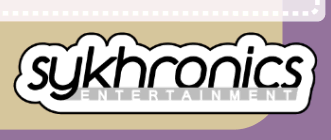
Ahh yes, a smooth graphic design’ish logo. Hurah.
Do I like it? I’m not sure. I’m torn between going with something more cartoony, or including a little face in the logo. It’s to represent a shift in Sykhronics’s direction. It’s certainly different. Perhaps it’s approprite weather I’m gaga over it or not.
Since 1998, Sykhronics was the branding I used for my independent works, and my personal website. Actually, it was the branding I had planned to use on everything, but I found I stuck my name on them instead, and Sykhronics ended up just being the website. Moving forward, since I’m turning this in to a business, it’s got to have a name. Mike Kasprzak Software sounds *really* lame, I have to say. My apologies to any developers with YOUR-NAME-HERE company names, but ‘cmon. I’d be happier if you called yourself Klingon Software, or Jedi Interactive. If all you’ve got to express yourself is nerddom, then so be it.
An earlier rendition of the logo is this, back when Sykhronix was going to be the business, and Sykhronics would stay as my personal site.

I have dozens of old Sykhronics logo’s which I’d like to dig up for my own reference, so I may post that soon. Half of the charm of developing Sykhronics has been my option to change the logo whenever I wanted. I’m leaning towards the new one above only to help solidify the more businessy approach I’m taking the branding, that is until I come up with something better.