The first step with Smiles was to up the art resolution. That way, I could cleanly resize to any resolution below 4x the iPhone (1920×1280).
Unfortunately, double and quadruple iPhone res are not practical resolutions. Double iPhone will work windowed on most desktop LCD and 720p screens (960×640), and quadruple in a window fits on a 30″ Dell or Apple Cinema display, but we could do better.
Also, not all screens are the same shape, but the solution isn’t too difficult. If we maintain a consistent aspect ratio, it can be fit without distortion to virtually any screen.
Dividing the width by the height gives us a scalar we can compare against the same scalar from other resolutions to know which axis we’ll have to align to. If the scalar is larger, then we align to the top/bottom. Otherwise, we align to the sides. If equal, both work.
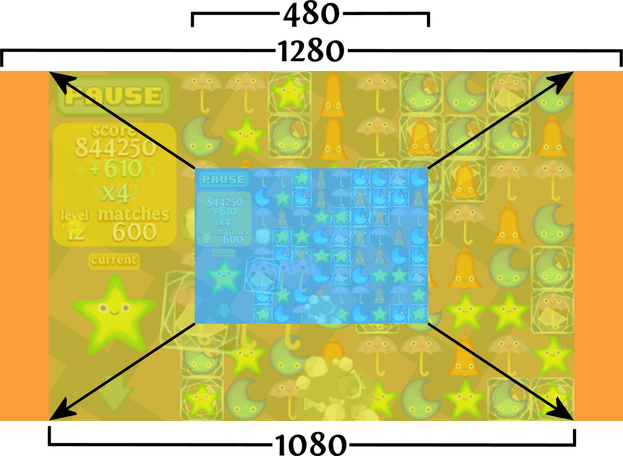
The following picture shows Smiles at it’s original size (480x320), pushed up as large as the height (1080x720) can fin in a 720p screen (1280x720). Note: the “1080” here is not the same thing as 1080p. Just an amusing coincidence.

This fits, but shows a good 200 pixels of empty space on the sides.
We could cop out at this stage, fill them in with black. That’s what TV does. Or if we care, we could do something about it.
One of the design niceties of Smiles is that the game has both a foreground and a background. The foreground is all our game stuff, fixed to the resolution and aspect ratio of the iPhone. The background is a tiled moving pattern or starburst. Both are easy to grow or size.
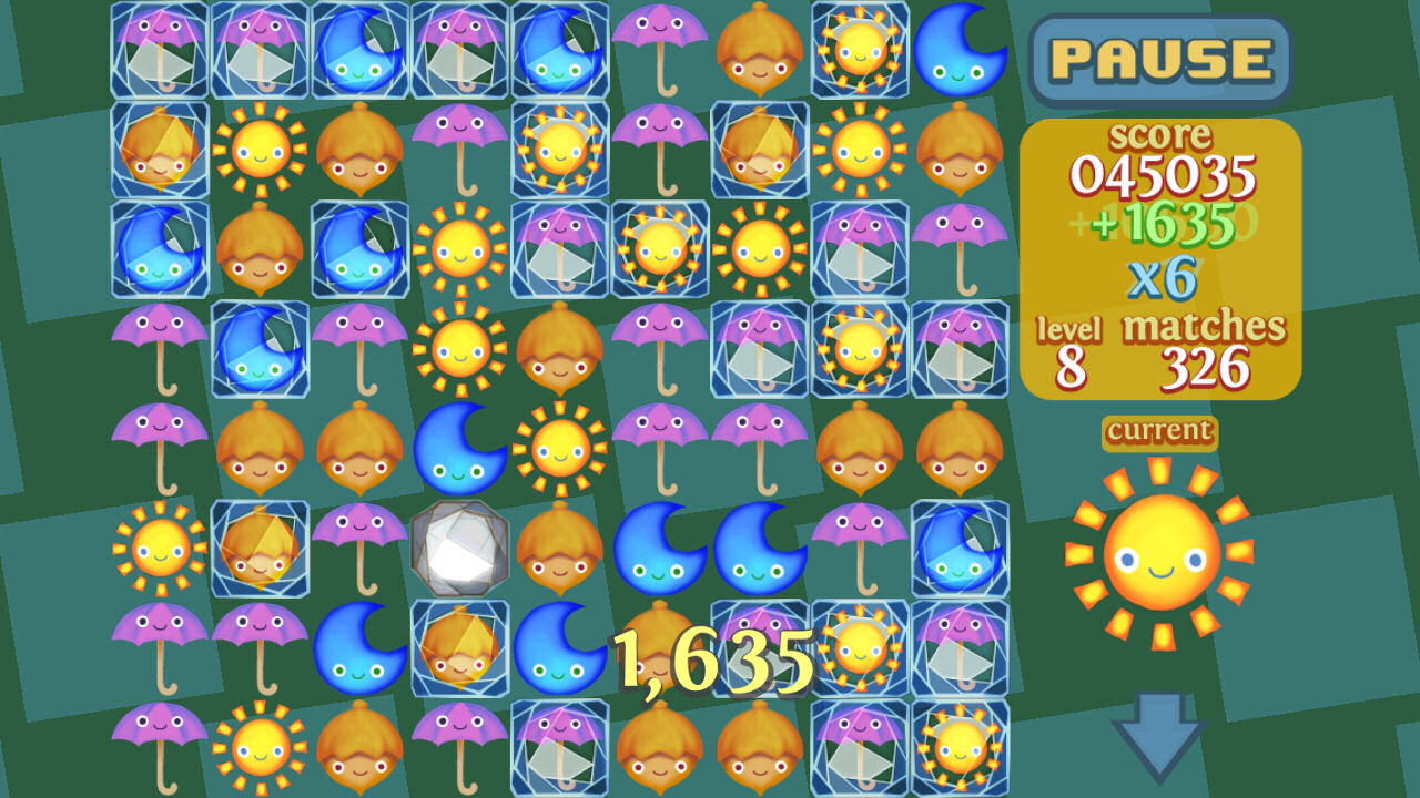
So instead of “black baring” it, I can grow the background to fit the screen.

At the moment I am cheating. I simply made sure I draw enough extra boxes over the sides to fill the width of the screen. Eventually I’ll have to make the backgrounds a little smarter, but GDC is coming up fast so time is short.
This looks better than filling in the sides with a solid color, but we’re not done yet. There’s still 2 things related to resolution and layout I’d like tackle before I move on. The first, overscan.