Whilst writing my recent post on the updated logo for the business transition of the branding, I was inspired to take a look at the progression of Sykhronics logos over the years. Some of the more recent logos are custom designed fonts, which is something I plan to again some day with the logo.

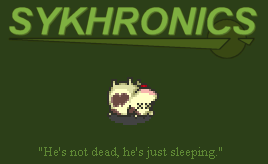
The latest/last logo on the classic Sykhronics website. Created and placed as part of my August 2003 website redesign. The established 1997 is sorta accurate, since this is my personal website/portfolio. Prior to Sykhronics, my productions used to be branded as Gamma Flare Games, and I set up my first website for it on Geocities way back in 1996. It’s a custom font of only the characters seen here, and distorted for effect.

This started as a Sykhronix logo style, but was later adapted to Sykhronics. Another custom font actually made italicized.

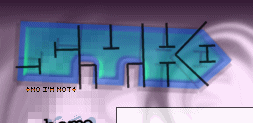
I nearly missed this one. A few years after I had made the site my showcase of stuff, this was how it looked. Not a custom font, but the box thing was cool enough to make it custom enough. Actually, the only reason I didn’t make a font is I was too tired to make it after making the box. ![]()
![]()
Pixely logo from 2002. Started out as a 3×5 pixel font, then sized up nice and big, filled in and applied a bevel effect. It always reminded me of something demo scene’ish, despite the blatant bevel effect look. I’ve made many pixel fonts in my day, including the infamous 3×5. I used to be able to reproduce the Commodore 64 font from memory. That’s my super power.

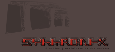
The brand new Sykhronix logo, made about the same time as the previous pixel one. This was a pure brown webpage with the odd tinted image seen above the logo. The idea behind it was just to have the look of one of those cool minimalist graphic designer webpages. It’s actually a photograph of some bridges between some buildings, but rotated sideways to make it less distinguishable.

A shortened version from 2002. “SYKO”, with a detached outline, and some crazy swirls in the background. Actually, now I’m curious how I did the swirls.

A variation from 2001 in an incomprehensible style and shortened. It’s supposed to be read as “SYKO”. Yeah, I can’t believe it either. At this point, my website had become more of an archive, listing my previous works, and previously completed commercial games. Exciting.

This was the first Sykhronix logo. Made for the dot com when I registered it.

The Red Karma’ized version of Sykhronics Logo. Red Karma was a small label/branding group including myself,
Kenny Thornton, and the guys at Execute (a long since abandoned group). Kenny was the only one to ever release anything under the branding, so it’s pretty much his. The logo also includes a colored drawing of Zeb, my old “cool” character that defined the Sykhronics branding way back when.

Digitalness was cool, so I just had to have a logo with a flashing cursor. In case you can’t see it, it’s beside the “click to enter…”.

One of the many logo’s from the return of Gamma Flare era. The return was a more like a conversation, a few weeks of building tools and art, and a return to slacking. It was glorious. Gamma Flare was mostly me, until a few short collaborative sessions between my brother, and another friend named Mike. Then when I adopted Sykhronics, Gamma Flare became the name used for our collaborative branding.

Here’s a logo from 1999 that was to be used on the new version of my site for my first domain, flatlined.on.ca. $70 for 2 more years seemed too expensive when I finally found you could buy .com domains online for $15.

Almost to the original. Hey, hold on, this actually looks cool! Done using some fancy Photoshop filter, before I was big on Paint Shop Pro.


Finally, the original 1998 beast! In many ways this was one of my favorites. I didn’t feel comfortable using it though, since I couldn’t easily reproduce the flame effect. These were both done with some fancy Photoshop filters, back when I hadn’t sold myself on Paint Shop Pro. The slogan, “Digital Funk in a Digital World” was partially inspired by a fighting game I was planing at the time, conveniently named “Funk World”. A cool animated gif of a character was all that really came of that game, yet the gif inspired the character that became Zeb.
So there you have it. A nearly complete web Logography for Sykhronics. Some logo’s never made it online, so if I come across these I may do another one of these.